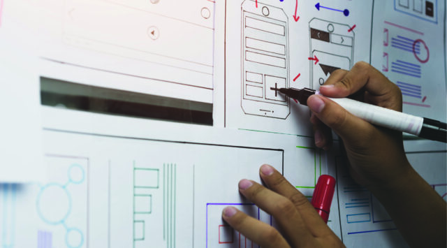

UX (short for user experience) is any way that a customer interfaces with a company during any part of the sales process. This term is mostly commonly applied to a company’s website or apps.
Good UX design is, generally, not overly noticeable. If you are doing it right, your customers should never have to think about how they interact with your company because its intuitive. Bad UX design is the opposite. It is anything that makes it harder to interact with you, your company, or your products.
The most common UX trap is a failure to identify your target audience. An ecommerce company that targets millennials will have different UX goals than if they were to target baby boomers. This is because the baby boomer generation has different UX requirements than the millennial generation. What feels intuitive to one group is difficult or isolating to the other and vice versa. Millennials may get frustrated with a UX design that relies heavily on phone conversations or feels to “dumbed down.”
Your product or service can only be considered successful if it is well-received by your customers. If you aren’t sure exactly who you’re selling to, you can’t know if you hit the mark when it comes to you UX.
Here are some (in)famous examples of Bad UX Design.
Apple Magic Mouse
Upon release, the Apple Magic Mouse was roundly criticized by consumers for one egregious design error: the charging port is located on the underside of the device, meaning that you cannot use it and charge it at the same time. Instead, you have to flip the device over, plug it in, and walk away until it’s ready. This is a violation of one of the most important principles of UX Design — giving control to the user. Amazingly, as of 2022, the Magic Mouse comes in a variety of colors but still charges from the bottom.
ATM Machines
This is calling out a specific feature rather than an entire device, but it’s an issue that’s common to many different kinds of ATMs, and results in a problem many of us have faced at one time or another.
Upon inserting a debit/credit card to make a cash withdrawal at an ATM, many ATMs are programmed to give out the money before returning the user’s debit/credit card. This enables users to forget their card which leads to user frustration when they discover it missing, and time and effort for the bank, when they have to cancel and replace the card.
Online Purchases
Online shopping is more popular than ever, and yet many seemingly obvious UX elements haven’t yet been figured out. A common mistake online storefronts make are long dropdown lists — for example, when stating your country of origin. If a company knows that most of their buyers come from the US, the intuitive thing to do would be to make that the first option in any dropdown list. Instead, most lists are alphabetical requiring tedious scrolling.
Companies often fall into the trap of thinking “it works = good enough” but true success comes to those who optimize. Reach out to CLS to talk about your UX design and ensure you haven’t lost business to frustrated customers.


